final portfolio

For starters I want to say, this class was essential to the growth of my digital knowledge. I grew up being someone really bad with using unfamiliar softwares and technology. Feeling like a blinded man left in a forest was the constant trope I dealt with while trying to attempt new technological skills. Another weakness of mine has been history. Throughout highschool I performed slightly average in history classes, being good with grasping timelines I did not experience was difficult, along with the memory portion of it. So stepping into this class was challenging for me off the bat, but I was caught by surprise. One of the issues of history I had was with grasping the relevance, but it was so obviously clear why we had to learn and teach details of slavery in todays world. It is so important to be frightened with tragic history to really comprehend the effects of systematic racism etc. I was captivated because I could really understand the importance, especially whilst we just had uproars of the Black Lives Matter protests. This was half of the battle for me, because I was very invested in what I was learning. The digital portion was the rest of the battle that I am proud of myself for pulling through. My favorite portfolio was text analysis assignment/computational text. I think it had to mainly do with my awe of how technology has made life easier for us. There are many parts of text analysis that make it super helpful as historians, the graphs, the cirrus, and bubble lines. 

Basic idea of text analysis is seeking the main idea in a text without taking the time to read it just yet, it uses word count word patterns to tell us this. The time efficiency that comes with this tool is a huge game changer. Computers are obviously way faster when it comes to these things vs a manual research setting. You get to overlook thousands of documents at one time while using this system. You have the option to access the more relevant source to you because of the sorting system by word relevancy. The text analysis makes it so you only see documents that have the most repetitive  pattern of the topic of your choice.  The documents with the most common words show up first, so you aren’t wasting time reading things that are of little relevance to you. I have spent hours reading through long articles just to know my topic search was only mentioned once in the whole paper, and the articles focus is nowhere near what I actually need. I can see how this will assist you in finding articles that overlap and agree with each other. Not only articles that agree but articles who carry the same load of the topic. The mining dispatch shows us the hands-on benefits computational text analysis can have. Having a graph as a visual representation is the most helpful tool any researcher could ask for. The graph is  what shows us what words show up the most in both topics . Imagine a human trying to recreate this skill, going through with annotations of word count would be a redundant and un time savvy task.  I can’t imagine how many significant parts of history have been slept on because people did not have the same access to readings and mails and documents like we do now. Biased opinions, research that lacks the full picture, incorrect data. 

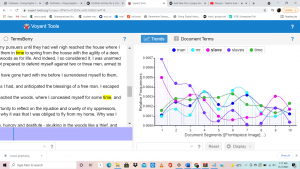
In portfolio 5 the verbal options were given to me was “man men slavery people race colored white free states god negro great country slave black state slaves government law liberty” . Using Voyant I was able to find out that the most common words were time (198); man (180); slave (179); slaves (176); mr (165).Throught this process I learned my favorite tool is the cirrus. This tool is basically a visual photo of jumbled words from the text, it uses the size of the text to explain how common the word is used in the text. This is so helpful because it takes one glance for a visual learner like me to grasp the essence of the text. In this cirrus for my task, I could see the word time were the most prominent following the word man. 

The next best visual tool is the graph. The graph takes those main words, and attempts to show us where in the text they occur the most. Each main word is a different line on the graph, in a different color, the x axis divides the text into 10 different segments, and the y axis is the relative frequency. This is helpful because if one of the main words I am looking for, pops up a whole lot of times towards the very end of the text, that might not be as helpful, despite having the text a lot. In my task, I learned that the word “slaves” was used the most in segment one of the article, secondly the word in segment one was “slave”. 

Next to that we see the actual pasted, but if we look more into it, you can hold your cursor over any word and it shows you the “document frequency”, or (how many times it shows up in the text). This is nice because, in all the other visuals, you only get to check the main words, but on this you can check ANY word you need. This tool is helpful even beyond the use of our need, I can imagine using this tool after writing a paper, to see how many times I used boring words, such as “good”. 

Whilst breaking apart the specific benefits of text analysis, I am realizing that the real reason this was my favorite sector of the class is because it made so much sense to me. Not necessarily because it may have been the easiest for me to perform. But it made me understand too much, I could see it helping me beyond just this one assignment, which is why I am so happy I took this class. I will take these skills and apply them in all my further endeavors. Being a psychology major, with the need of writing many research and research papers. I will love to use text analysis tools to help me sift through the sea of articles.

text analysis

My question is , is there a way to highlight the difference between frequency of words. I was put into group three in which we had to look at documents in topic 2.  The verbal options were given was “man men slavery people race colored white free states god negro great country slave black state slaves government law liberty” . Using I was able to find out that the most common words were time (198); man (180); slave (179); slaves (176); mr (165).Through this process I learned my favorite tool is the cirrus. This tool is basically a visual photo of jumbled words from the text, it uses the size of the text to explain how common the word is used in the text. This is so helpful because it takes one glance for a visual learner like me to grasp the essence of the text. In this cirrus for my task, I could see the word time were the most prominent following the word man.   The next best visual tool is the graph. The graph takes those main words, and attempts to show us where in the text they occur the most. Each main word is a different line on the graph, in a different color, the x axis divides the text into 10 different segments, and the y axis is the relative frequency. This is helpful because if one of the main words I am looking for pops up a whole lot of times towards the very end of the text, that might not be as helpful, despite having the text a lot. In my task, I learned that the word “slaves” was used the most in segment one of the article, secondly the word in segment one was “slave”. 

Next to that we see the actual text pasted, but if we look more into it, you can hold your cursor over any word and it shows you the “document frequency”, or (how many times it shows up in the text). This is nice because, in all the other visuals, you only get to check the main words, but on this you can check ANY word you need. 

My question at this point was already answered, the cirrus itself made it super clear that you can easily be informed on different frequencies very simply. I would probably alter my question to “which of these visual representations are the best at showing us information in a timley manner “. For which I have already received the answer and it would be the cirrus, that one is enough to show us the rates of plenty of words at just one glance. The issue with the other ones may be time, I do feel the cirrus takes the least time when getting to analyze the visual representation. But what is nice is that I can actually see myself using voyant for personal reasons. 


Solomon Northups life

https://uploads.knightlab.com/storymapjs/a7c5d30f447ae664c8f3936372c08ff5/solomon-northup/index.html

For starters I want to say that Solomon Northup’s life sunk my heart. He was a free man for thirty years before he was tricked into slavery. I used storymap to map out his life with major events and the cites he was in. It was super cool to see the end product of the slideshow, as it shows the movement of his life travel. He was living his life as a farmer and violinist in Minerva New York. He then married his wife Ann Hampton and moved to Saratoga springs. To sustain his family he was looking for jobs with his violin skill. He was offered a job to play violin with a circus, once he had travelled with the circus to Washington DC. There he was tricked into slavery and his 12 years of being one began. Of course all slaved had a tragic story, but to have been free your whole life and then be taken captive is unimaginable. I chose photos that showed his whole lifetime. I started off with him as a kid to portray his childhood on the farm with his family, and the place was Minerva, New York City. Next I added a picture of his wife, Ann Hampton, and the place given was Saratoga springs. I wanted to include this because I feel it portrays the normalcy in his first 30 years of living which then shows the tragic contrast in his then enslaved life. I next found a picture that portrays people being tricked into slavery with the circus gimmick. Following that I added a photo of Solomon Northup in his enslaved years, which was a very sad photo, which would be a light representation of his enslaved life. Then my final photo was his book “12 years of slave”. I think it was important to show this wide spread set of events to really give a feel of what his life was like and the tiresome journey he had from a free man to getting his life turned upside down.

geospatial visualization.

Geospatial visualization really strengthens the knowledge historians have of different time periods. I grew up being a visual learner. Weather that came to learning dance choreography, learning math or even makeup. The concept of Geospatial visualization surrounds using maps to tell the story of a period of time, the movement of people through pictures. People may ask why this is necessary whilst having straightforward informational texts and documents. While geospatial visualization may not be sufficient for learning just by it self. it adds a third dimension to learning. You can go back in time and see how people moved along the years and retrace these buried steps.

In theory there shouldn’t be anything too problematic with this method, but there definitely are. Since a lot of this concept is based off of grasping the photo there is a lot that can go wrong in interpretation. They are not always easy to understand. There can be a lot to look at and a lot to comprehend. They are not too information rich, which makes a lot of self comprehension. I struggle in the aspect of chronology, where does one look first? Looking at it as a whole does not do me too much help disecting it piece by piece and piecing it all together is the best bet.

This photo is a dot density map on the population of Baltimore. I can assure if I had seen numbers on a table I would not have understood as much as I am understanding visually right now. At just one glance I can see purple (white people), blue (enslaved black people), the comparison to these quantities are very easily understandable to the naked eye. When taking a closer look I can see how dense certain areas are and how sparse others are. If this was just a table with numbers, we would not be able to tell those differences in population so eloquently and quickly.

Fells Point in Baltimore

This image used different colored houses to represent difference races living in a neighborhoods. Although it would be a rookie mistake, getting mixed up between which owns which house would be problematic to understanding the real situation. That is not something that could be easily done with a table and the straightforward nature of a table.

portfolio 4

Computational text for me is an absolute essential. As a historian it is something that would lessen the work load a lot I feel. The manual era seems impractical to a person who grew up in the digital era, even things as simple as looking for  book without a catalog, let alone research. One unsung plus of digitalization is the universal factor. Previous to these discoveries we would have to go to an area if wanting to read about it, now its a click away vs being an ocean away. This unites the world, we can only progress in time if we know to not make mistakes made before, and not only our own countries’ mistakes but other parts of the world included, with different point of views. Losing point of view can give historians a lack of full truth in research, the full picture will not yet be obtained. The time efficiency that comes with this tool is a huge game changer. Computers are obviously way faster when it comes to these things vs a manual research setting. You get to overlook thousands of of documents at one time while using this system. You have the option to access the more relevant source to you because of the sorting system by word relevancy. The text analysis makes it so you only see documents that have the most repetitive  pattern of the topic of your choice.  The documents with the most common words show up first, so you aren’t wasting time reading things that are of little relevance to you. I have spent hours reading through long articles just to know my topic search was only mentioned once in the whole paper, and the articles focus is no where near what I actually need. I can see how this will assist you in finding articles that overlap and agree with each other. Not only articles that agree but articles who carry the same load of the topic. The mining dispatch shows us the hands on benefits computational text analysis can have. Advertisements seeking enslaved peoples for labor was the source specialized here. Having a graph as a visual representation is the most helpful tool any researcher could ask for. The graph is  what shows us what words show up the most in both topics . Imagine a human trying to recreate this skill, going thru with annotations of word count would be a redundant and un time savvy task.  I cant imagine how many significant parts of history has been slept on because people did not have the same access to readings and mails and documents like we do now. Biased opinions, research that lacks the full picture, incorrect data. In all entirety computation text analytics was the best thing to happen to us historians. Weather that be talking about a time issue or comfort issue. When being the least stressed is when we can write at the most quality, the avoidance of frying your brain is what this gives you, setting you up for success.

website review

This is a review of Slavery Images, which is a visual record of that time period. http://www.slaveryimages.org/s/slaveryimages/page/welcome .As a whole the website consists of over 1200 images to be viewed. I personally felt like that was kind of low till I realized that these are very specific photos in categorical order. Next to each picture they have detailed descriptions that are essential of course. I appreciate the detail given of the source and such. They have a good break down of source, citation, rights, spatial coverage. The welcome page consists of a super cool feature, A map. Not just any map but a map you can click on to see photos associated with that area.  The website is divided into categories such a “auctions” “and ships”, “marketing and urban scenes” , Physical punishment, “rebellion and running away” etc etc.  When clicked on the link it takes you to a whole page of  photos in these categories. This would be very helpful for people looking into specific topics. I like this design because the layout is very user-friendly, you can easily skim over and find what you need to find. This website audience is generally anyone trying to educate themselves, students teachers and general public. The plus point of the “user friendly” nature makes it so all age groups can use this website comfortably as well. The website has partners that include UNESCO, university of Virginia, and university of Colorado boulder. In all entirety this website is very helpful to people of all audiences, I hope it gets more funding and gets around!


Second post

I struggled a lot to figure out how to go about this weeks assignment. I had to go back and re-read all the links to understand the process of this. I am still unsure if the way I went about this was correct or not, I edited the boxs in the omeka but I also have many more images that show up in my exhibit. But once I familiarized myself with the directions my process of finding these two pictures was fairly very easy. As my topic is misogny in enslavement era, I just searched the tag women.  https://s3.amazonaws.com/omeka-net/62445/archive/files/fd1b515a41d14bfea41410118a7cb47e.png?AWSAccessKeyId=AKIAI3ATG3OSQLO5HGKA&Expires=1635379200&Signature=igJ6QkiS%2FTba11OIh2mB00Ye%2FtI%3D This was the first thing that came up that was pretty good for my topic. Although it directly does not answer my thesis I can get a lot of good info on how the times were for women as a whole.  The title of this image is “African American women who escaped slavery in 1855”. The description was interesting as well, she dressed in male attire to achieve her desired freedom. My second piece was a letter. https://h251.omeka.net/admin/files/show/7 . It was essentially an agreement on letting a slave go in ten years of time. But by the time 10 years was up the slave, Dinah, would most probably have passed. This is because life expectancy at that time was very low. This truly broke my heart because Dinah probably felt so much hope at the time that agreement was written.  I wonder what actually happened and if Dinah was alive to be freed from her living hell.

misogny in enslavement

We have come to know that there were way more male slaves at the time than female slaves. But based off what we read I want to know the core differences in the treatment between female slaves and male slaves. I want to know roots of systematic sexism that rooted from this time. I hope to research a lot of different topics within this core question. Including comparison of rate of rapes, double standards within one another and sexualization. I went to the DPLA website and searched “female slaves”. I had a lot of photos pop up and some research papers. I opened “Degradation, Humiliation perseverance: A study of female African American slaves  in comparison of female Holocaust victims, 2008, written by Cerise.C.Marshall.   This paper chose to specialize in this topic to add a female perspective  as the face of these tragedies mainly include the male experience. Many anecdotes were used to explain the themes of that time period. One thing that can be easily said is that women had a whole other perspective as slaves and holocaust victims, the types of torcher are opened to a lot of other things due to being sexualized.  Southern laws did not recognize rape of black women as a crime.  This paper seemed very keen on comparing two tragedies with stories rather than the focus on black female slavery.  So next I decided to do a google search, I searched up “female vs male slavery”, I landed an article on PBS.org called The slave experience, by Jennifer Hallam. This article speaks on how women slaves often stayed in bondage so they could stay in more touch with their children. But this often meant having to be in alliance of their master fulfilling their sexual needs on command. I got one of the biggest answers to my thesis. I wanted to find root causes for the sexualization of black women today by knowing how misogny worked for them back then. This text explains how black women were made out to be lustful beings. I am saying this is so they could tone down the idea of rape with “they wanted it or initiated it”.  I do believe in someway exploring the female perspective of slavery will be difficult as female voices at that time weren’t deemed important till recently. But through old documents and photos and articles, I am confident I can dig deep into my thesis.

Intro

Hi my name is Pooja, Im a junior in college currently doing my major in psychology! My primary end goal is to become a self employed psychotherapist along with being able to pursue my dance career in india. I chose this line in the trust I have in my emotional intelligence, but my intelligence in other areas can be questionable haha. Nothing stresses me out more than getting a ahold of technology and digital work. Definitely a reason I chose this class. For someone who despised computer lab as a kid, starting a website is a big deal for an old soul like me. Restarting my computer is about the most talented thing I can perform solution wise. This my only in person class and I am a commuter so I hope I can make the best of it. A couple random things about me is , I have travelled to twenty five countries, I hate having lotion on my hands and I used to make tiktoks and had like 143K followers. I want a lot more interaction with my peers in classes, so if anyone wants to start a study group count me in! The small conversations with people are the most energizing thing for me, which is something I really missed in the pandemic. Whether that be sharing a few words with the person near me on the bus or having full on personal conversations with my professors. I want to say Ive learned how to be a lot more introverted and enjoy my own company but I have trained myself in enough of that these past years, time to get back into class time banter and small talk with strangers. Hopefully we get to have in class conversations along with our replies on our website. Lets hope for a great class guys!!!