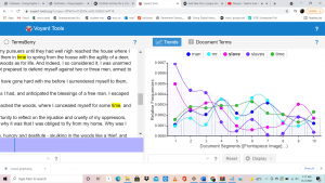
My question is , is there a way to highlight the difference between frequency of words. I was put into group three in which we had to look at documents in topic 2. The verbal options were given was “man men slavery people race colored white free states god negro great country slave black state slaves government law liberty” . Using I was able to find out that the most common words were time (198); man (180); slave (179); slaves (176); mr (165).Through this process I learned my favorite tool is the cirrus. This tool is basically a visual photo of jumbled words from the text, it uses the size of the text to explain how common the word is used in the text. This is so helpful because it takes one glance for a visual learner like me to grasp the essence of the text. In this cirrus for my task, I could see the word time were the most prominent following the word man. The next best visual tool is the graph. The graph takes those main words, and attempts to show us where in the text they occur the most. Each main word is a different line on the graph, in a different color, the x axis divides the text into 10 different segments, and the y axis is the relative frequency. This is helpful because if one of the main words I am looking for pops up a whole lot of times towards the very end of the text, that might not be as helpful, despite having the text a lot. In my task, I learned that the word “slaves” was used the most in segment one of the article, secondly the word in segment one was “slave”.
Next to that we see the actual text pasted, but if we look more into it, you can hold your cursor over any word and it shows you the “document frequency”, or (how many times it shows up in the text). This is nice because, in all the other visuals, you only get to check the main words, but on this you can check ANY word you need.
My question at this point was already answered, the cirrus itself made it super clear that you can easily be informed on different frequencies very simply. I would probably alter my question to “which of these visual representations are the best at showing us information in a timley manner “. For which I have already received the answer and it would be the cirrus, that one is enough to show us the rates of plenty of words at just one glance. The issue with the other ones may be time, I do feel the cirrus takes the least time when getting to analyze the visual representation. But what is nice is that I can actually see myself using voyant for personal reasons.